CHALLENGE
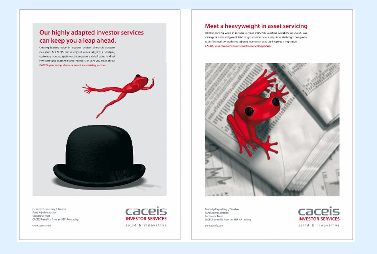
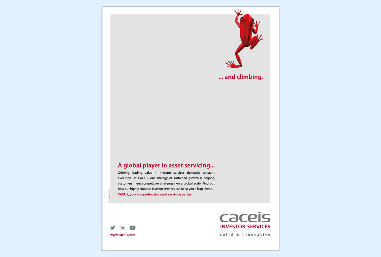
As a French financial services company and a new entrant in the asset servicing market, Caceis needed to break through in a landscape dominated by large, Anglo-Saxon banks. There were two ways to go on this: either adopt the visual codes already established in the banking industry, or find a more distinctive way of highlighting the strengths of this new, global player.
SOLUTION
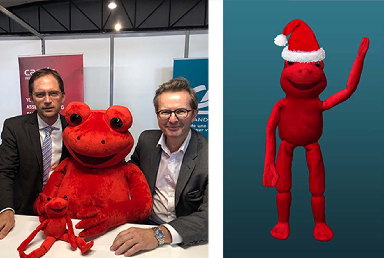
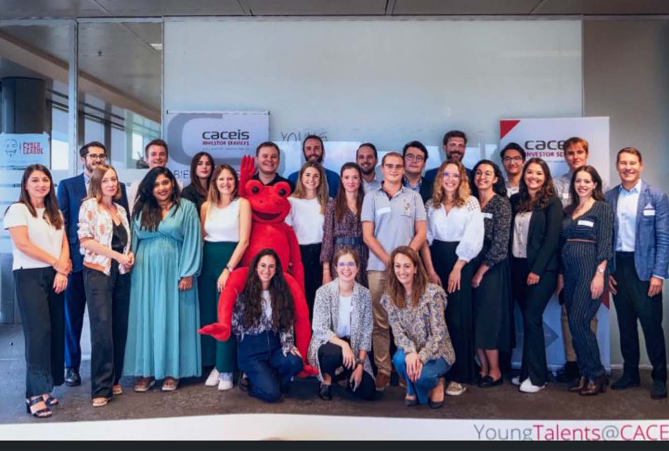
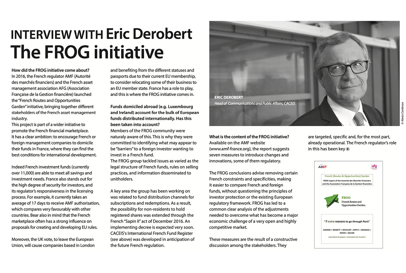
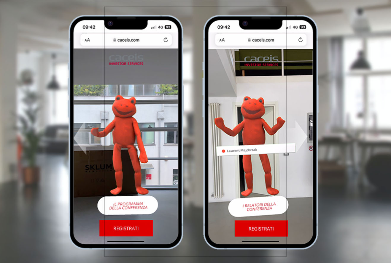
The Caceis frog was born! Based on a species of Amazonian tree frog, the Caceis mascot conveyed the company’s small (no longer the case), smart and agile nature. Well into its second decade, the Caceis frog has become a cherished and highly recognizable emblem of a financial institution with a difference.



CHALLENGE
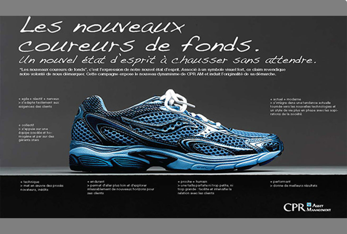
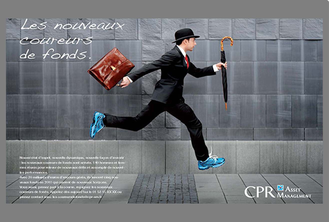
French financial services provider CPR needed to distinguish itself from the competition and demonstrate its agility and performance in the field of asset management.
SOLUTION
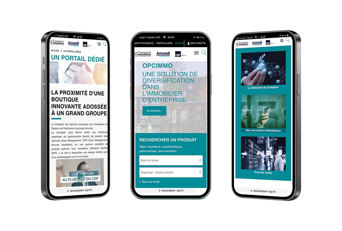
A campaign was created based on high-performance running shoes, comparing them to classic black Oxford shoes, a symbol of classic financial centers. Pierre-Yves Linnot, our French copywriting partner, worked with Jan Ragnartz on the concept and art direction. The running shoe theme was extended when we named and branded CPR’s newsletter to wealth advisors: ‘Le Comptoir’.


CHALLENGE
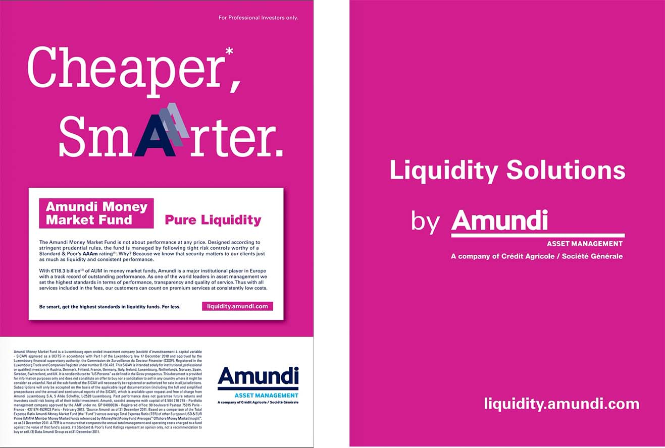
Amundi, a leader in the global asset management industry, launched a new money market fund and needed the new offering to break through in a highly crowded field.
SOLUTION
A campaign was conceived based on the insight that corporate treasurers were some of the sector’s hardest to reach customers with little time to consider new financial services offerings. This gave rise to the ‘Money Market Minute’, a series of videos that explained the advantages of the fund in one-minute, bite-sized instalments.


